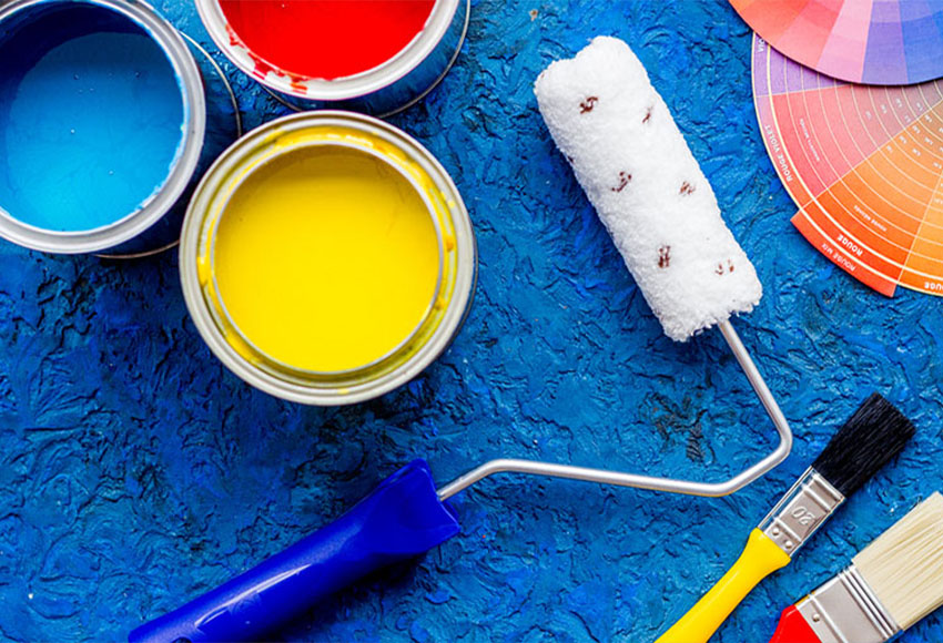
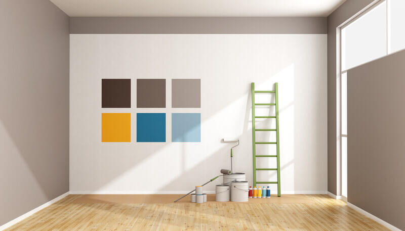
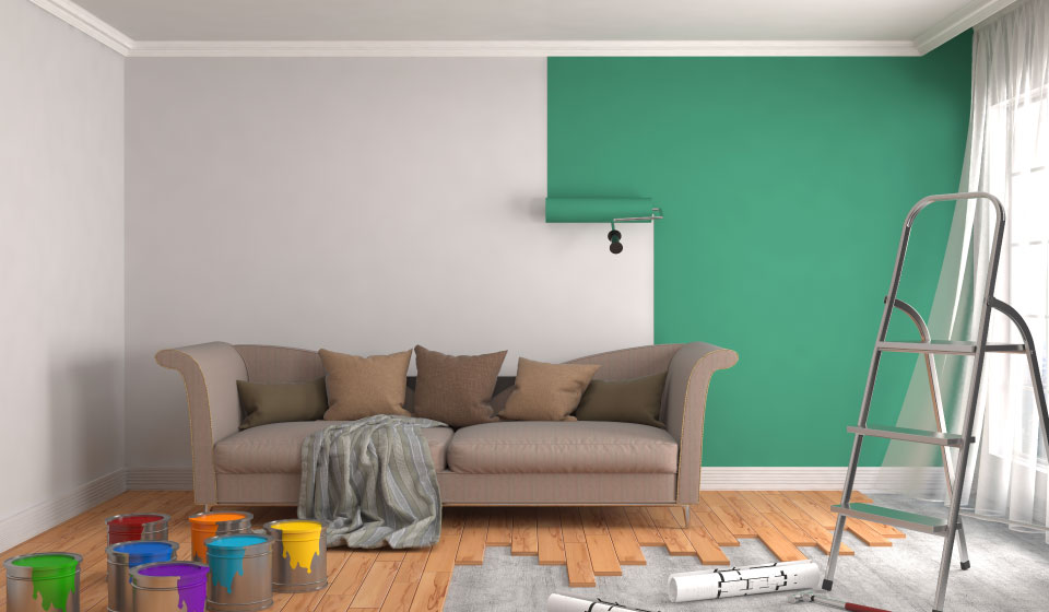
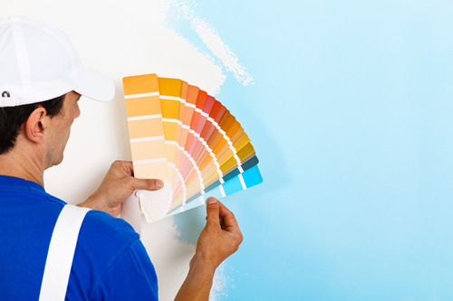
This blog was written to help you better understand the make-up behind colours, colour schemes and complementary colouring to help bring your home to life whether it be from painting or simple furniture changes!
Primary Colours
Primal colours are ones that can be created by mixing other colures together,
these include yellow, blue and red. Instead, primary colours combine to create
secondary colours (equal amounts of two primary colours mixed) and
eventually, tertiary colours (will get to this later). Thus, all colours stem from
these three primary colours.
Secondary Colours
Secondary colours are a result of mixing equal amounts of two primary colours
(yellow, blue and red). Red and yellow make orange, blue and yellow make
green, red and yellow make purple and so on. If you adjust the ratio of mix it
will in turn change the shade of the final colour, for example mixing 1 part red, and
2 parts yellow will make a lighter orange than 1-part red and 1 part yellow.
Tertiary Colours
Tertiary colours, aka intermediate colours, are a result of mixing equal parts of
primary and secondary colours. Most of the time they are named after the two
colours that created them, e.g., blue-green, orange-red and so on are made by combining equal parts of primary and secondary colours.
Sometimes they’re named after the two colours that created them, there are
six in total: (red-orange), magenta (red-purple), violet (blue-purple), teal (blue-
green), chartreuse (yellow-green) and amber (yellow-orange).
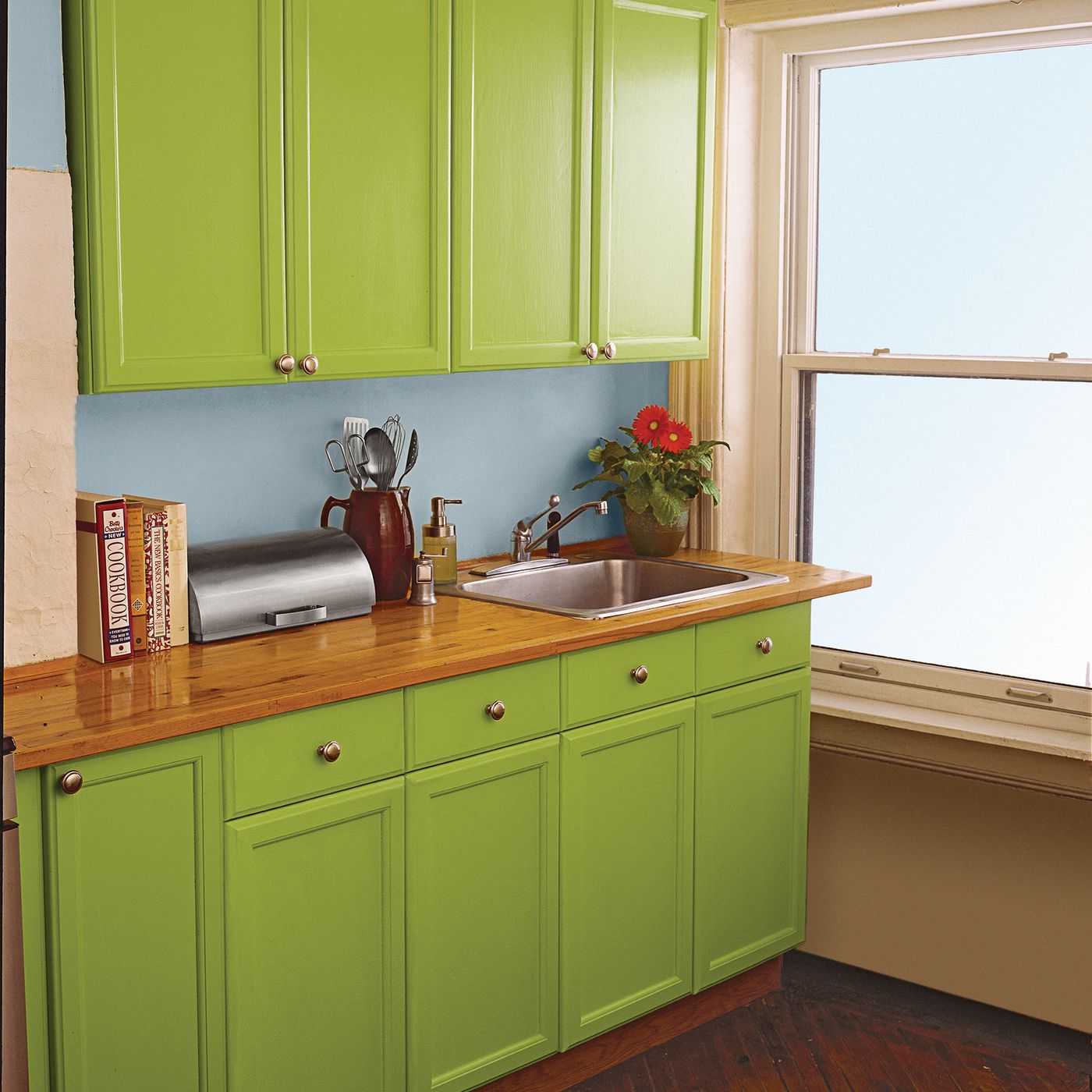
Complementary Colours
Complementary colours are hues that are diametrically opposed on the colour
wheel and contrast with one another. The colour wheel is a tool for designing
harmonious colour schemes since it organizes all the colours on the spectrum
according to their relationships. Complementary colours enhance each other’s
intensity when placed right next to each other, which is why they’re often used
to create bold, high-contrast images that pop.
Colour Relationships
The colour wheel is the most prominent representation of colour theory’s fundamentals. There are, however, numerous ways to depict colour correlations. enhance each other’s intensity when placed right next to each other, which is why they’re often used to create bold, high-contrast images that pop.
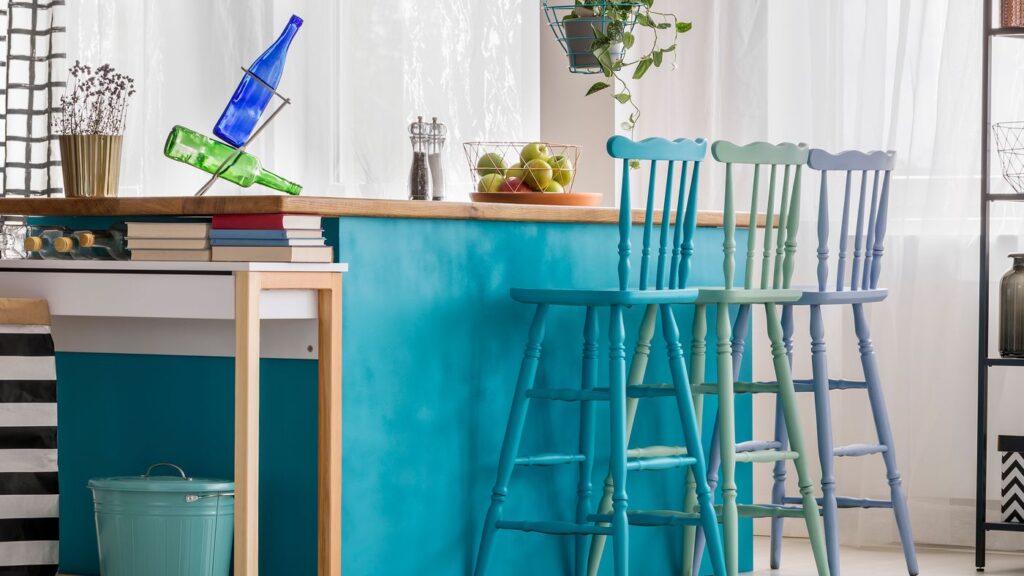
Analogous Colours
On the colour wheel, analogous hues are next to each other. In contrast to the intensity of complementary colours, they are visually pleasing and have a
relaxing impact when used together. In a scheme of similar colours, one colour is usually the dominating hue, with a second colour supporting it and a third colour acting as an accent. Nature or tranquil surroundings are frequently
depicted in artworks with similar colour palettes.
The Colour Wheel
The colour wheel, also known as a colour circle, is a circular arrangement of colours arranged according to their chromatic relationships. On the colour wheel, the primary colours are equidistant from each other, with secondary and tertiary hues in between. It’s a technique used in art and design to select colours and colour schemes based on their interrelationships.
Painters’ Colour Triangle
The painter’s colour triangle is a triangle-shaped arrangement of colours with one primary colour at each corner and secondary and tertiary colours in the middle. The painters’ colour triangle, in contrast to the colour wheel, places a
greater emphasis on the fundamental colours and, because of its three-sided
the design makes it simpler to see the combinations between them.
Nine-Part Harmonic Triangle of Goethe
Goethe’s colour triangle is another way of depicting colour relationships with an emphasis on the three primary colours. In it, both the painters’ primary
colours and printers’ primary colours are represented. The three printers’ primaries are located at the three main vertices on the triangle. With dark neutral tertiaries between the primary colours, the way the triangle divides allowed Goethe to choose colours based on moods. The way the triangle
divides allowed Goethe to choose colours based on moods, with dark neutral
tertiaries between the primary colours.
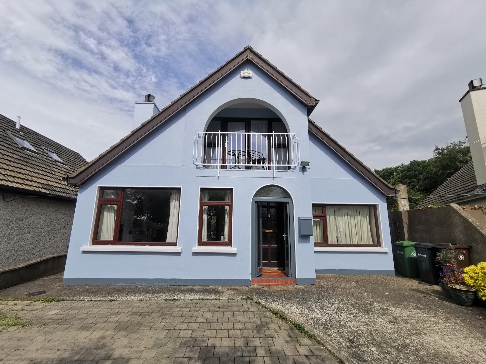
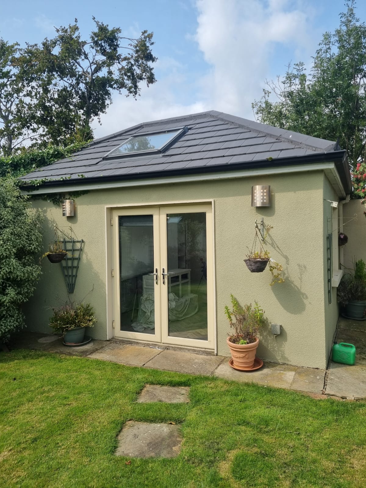
The small paints company hopes this blog helps give you a better understanding
of colours that compliment each other and can help bring your home to life. If you have any further questions or would like to get booked in for any painting job, the small paint company would be happy to help. We currently cover
North Wicklow, South Dublin and North Dublin. No painting job too big or too
small!