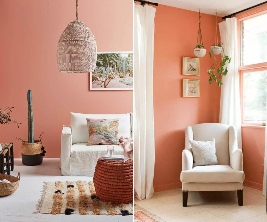
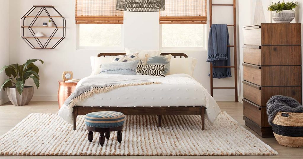
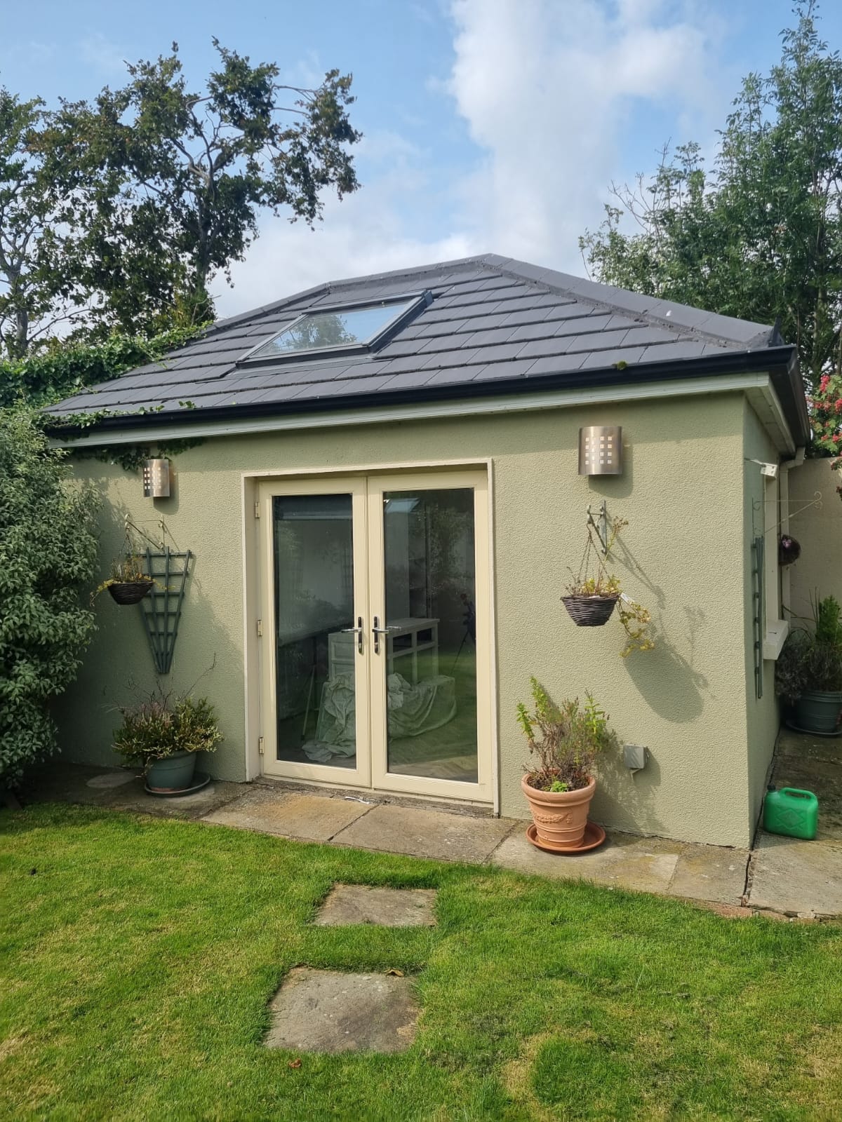
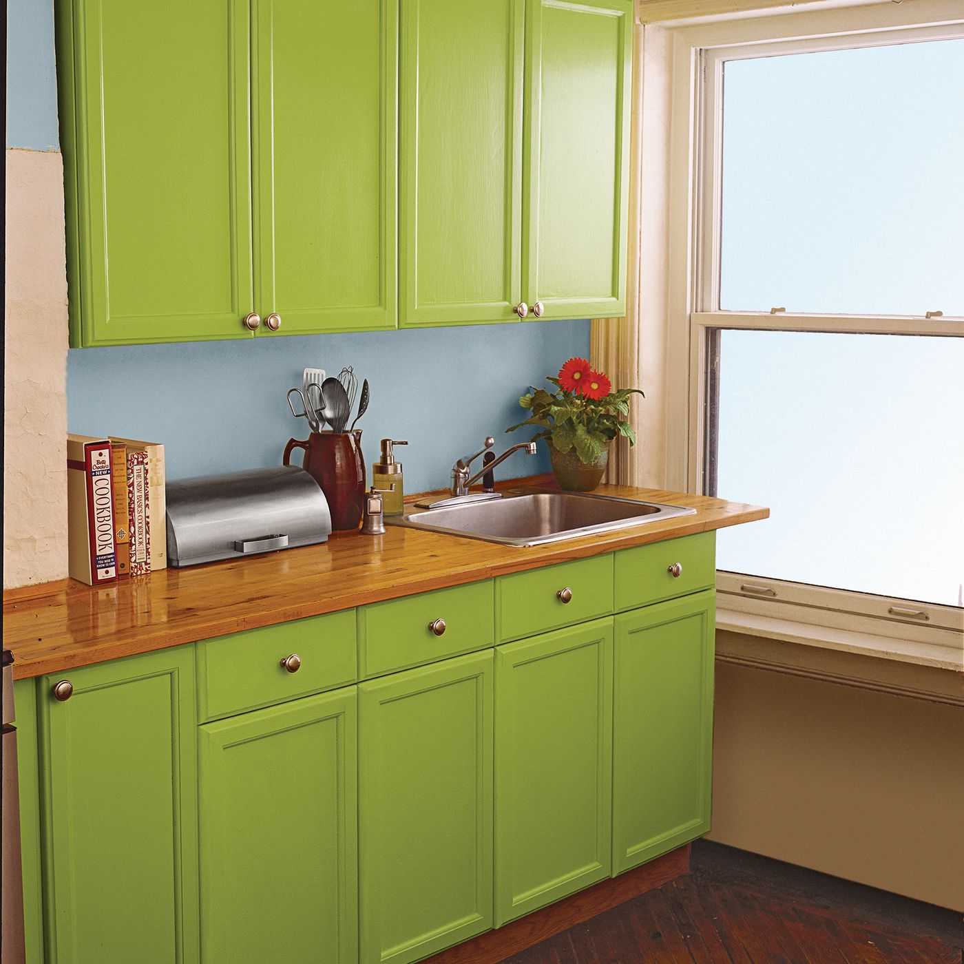
Professional home stagers are aware of how to highlight your property’s virtues while minimizing its drawbacks to appeal to a broad range of potential buyers. We spoke with a number of experts across the nation to obtain their advice on how to update the rooms in your house on a tight budget.
1. Set The Mood at The Entrance
Paint the entrance door a vibrant, glossy colour to give a wonderful first impression of your home. In early America, a crimson door symbolized “welcome” to weary travellers, and in churches, it symbolizes a safe sanctuary.
Orange and Yellow are two other colours that are popular right now. Both hues are linked to happiness and warmth. An obsolete screen door is one item that needs to be removed. Get rid of it or swap it out for a storm door with full-length glass and a screen panel that you can swap out.
2. Paint Walls with Light and Neutral Colours
Particularly on the first floor, where flow is crucial, stick to neutral hues like beige or grey. You have the most decorating options with neutral walls because you can quickly change up your accessories.
Additionally, painting two tiny rooms in the same neutral shade makes them appear larger if they are near to one another. Our painter advises looking at a paint strip and adjusting the colour by one or two shades to create minor variations from room to room.
3. Make Sure Your Sofa Can Communicate with Your Chairs.
Consider a well-designed hotel lobby where the furniture is arranged in conversation-prompting groupings. In your living room, try to achieve a similar sense of harmony and intimacy while placing the furniture.
The perfect conversation space, according to our decorators, is either an H-shaped set up with a sofa directly across from two chairs and a coffee table in the middle of a U-shaped set up with a sofa and two chairs facing each other at either end of the coffee table.
Avoid making the frequent error of pushing all the furniture up against the walls. Floating the furniture away from the walls makes the room feel bigger.

4. Let The Sun Shine
A naked bank of windows is better than an unsightly one when it comes to heavy, out-of-date drapes. Window treatments should ideally be both stylish and practical: Think of sheers combined with long panels.
Choose bright hues that won’t fade if your room receives a lot of sunlight. Because they tend to hang beautifully, cotton, linen, and silk blends are the most suggested lightweight fabrics for panels.
5. Hang A Mirror in Each Room
Mirrors can increase the perception of brightness in a room by reflecting light. However, misplacing one might be almost as awful as leaving one out altogether.
Instead of immediately across from windows, place mirrors on walls that are perpendicular to them. The light can be reflected back out of a window by hanging a mirror exactly across from it.
6. Always Scale Your Artwork to Your Walls
There are not many things that seem more ridiculous-looking than hanging little art too high on the wall. A photograph should hang at eye level in the centre. Average the heights of the two people if one is short and the other tall.
Don’t forget to consider scale; if you have a vast wall, go big with one oversized piece or group smaller pieces gallery-style. Avoid placing the images too far apart; 2 to 4 inches between each item typically looks the best.
7. Layer Your Lights
There should be three different types of lighting in every space: ambient, which provides general illumination and is frequently provided by ceiling fixtures; task, which is frequently found over a kitchen island or a reading nook; and accent, which is more aesthetically pleasing and highlights items like artwork.
You need at least 3 watts (42 lumens) per square foot of lighting in a living area. Our decorator swears by one visual technique: employing uplights. A canister uplight or torchiere placed in the corner will create a glow on the ceiling, expanding the appearance of the space.

8. Pin Your Rugs Under Furniture Legs
For an area rug, abide by these fundamental guidelines: the rug should delineate the seating area in a living room by accommodating all four of the sofa’s and chairs’ legs. The sofa and chairs should at the very least have their front two legs resting on them.
Even modestly sized living rooms often need an 8 by 10 or a 9 by 12-foot rug to appropriately accommodate a seating area. If the rug size is too small, everything will appear out of proportion.
9. Call In the Professionals
You gradually become less aware of the mess in a home the longer you dwell there. You occasionally require a new set of eyes. You can engage an organizer for a few hours to work on your closets and bookcases, which stagers say are sometimes stuffed with twice as much stuff as they could hold; expect to pay €30 to €100 per hour, depending on where you reside.
We recommend reducing what’s on your shelves by 50%. Next, scatter decorative items like bowls or vases amid the vertical rows and mix horizontal stacks of books in.
10. Use Visual Tricks to Increase Your Ceiling Size
It will feel less cramped if your ceilings are painted white if they are on the low side. Our expert advises hanging drapes higher than the windows to deceive your eye into believing the room is taller. The majority of common curtain panels are 84 or 96 inches long, giving you around 3 inches above the window casing before the length becomes insufficient.
Custom drapes must be ordered if you want to hang them higher. Do you adore patterned walls? Consider using vertical stripes to make your walls appear longer. A big mirror leaning up against a wall can help make a space appear taller.


